Qur’an Illumination: How Gold and Geometry Guided the Reader
How illuminators used gold, pigments, geometry, vegetal forms, headings and marginal signs to structure Qur’an manuscripts as well as beautify them.
Illumination is the painted and gilded decoration that works with calligraphy to organize a manuscript page. In Qur’ans, it may frame an opening, mark a sura heading, separate verses, signal textual divisions or identify a place for prostration. Gold and color honor the sacred text, but the decoration is not simply an ornamental border added after writing. Page design coordinates script, blank space, markers and margins into a system for reading and recitation.
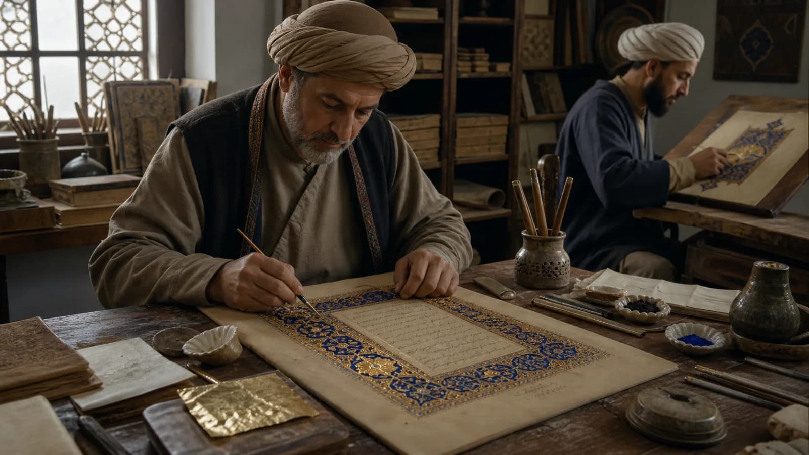
This article uses an original AI-assisted visual reconstruction for educational context. It does not reproduce a specific Qur’an page or portray a documented workshop.
Planning before painting
A manuscript team first had to establish the text block, line spacing and hierarchy of openings and divisions. Roles could overlap, but complex commissions might involve a calligrapher, illuminator, ruler, paper preparer and binder. Light guidelines set out borders and symmetrical panels. Compass and straightedge supported geometric construction, while repeating vegetal forms were transferred, mirrored or redrawn by hand.
Gold could be applied as leaf over an adhesive ground or as powdered metal suspended in a medium, depending on the desired effect and local practice. Burnishing compacted the surface and intensified reflection. Blues might derive from costly mineral pigments or other colorants; red, green, white and black balanced the palette. Material analysis is essential because color names alone do not identify a pigment recipe.
Decoration that carries information
Arabic script has no capital letters that function like European illuminated initials. Instead, visual hierarchy can emerge through a change of script, gold headings, rosettes, marginal medallions and illuminated opening or closing pages. A verse marker helps divide recitation; a marginal sign may identify a section. Readers therefore moved through both written words and a designed field of cues.
Styles varied enormously. A restrained early parchment Qur’an, a monumental Ilkhanid volume, a blue-and-gold Ottoman manuscript and a Kashmiri page with dense floral illumination belong to different material and visual traditions. It is misleading to explain all nonfigurative decoration only through a universal prohibition on images. Qur’anic contexts generally privileged calligraphy and nonfigural ornament, while figural imagery existed elsewhere in many Islamic artistic cultures.
Reading the page as evidence
Ask which marks belong to the original campaign and which were added later. Changes in pigment, hand or alignment may show correction and reuse. Compare repeated motifs across a double-page spread, and observe whether ornament sits under, around or over the ruling. Flaking gold and trimmed margins can indicate later rebinding; separated folios can erase the rhythm created by facing pages.
The most accomplished illumination never competes randomly with the text. It controls pace: concentrated splendor announces an opening, small markers sustain navigation, and unpainted space gives calligraphy room to breathe. Its history is therefore a history of devotion, skilled labor and information design at once.


