如何辨認庫法體、納斯赫體、蘇魯斯體與納斯塔里克體
庫法體、納斯赫體、蘇魯斯體與納斯塔里克體要怎麼區分?以《藍色古蘭經》書葉、哈姆杜拉冊頁、奧斯曼文字描述板及赫拉特《薔薇園》為例,比較字母比例、大小、排列與材料,分清書體、正文語言和文本內容;保留館藏紀錄對年代、產地及作者歸屬的限定,也說明為何斜排文字、金色筆畫或華麗邊框不能單獨證明書體。
庫法體(Kufic)、納斯赫體(Naskh)、蘇魯斯體(Thuluth)與納斯塔里克體(Nasta’liq),是阿拉伯文字書法中不同的傳統。許多庫法體作品有明顯稜角與延長橫畫;小字納斯赫體可與較大的蘇魯斯體同頁;納斯塔里克體尤其連結波斯詩歌,以曲線和傾斜字組形成節奏。可靠的辨認方式,是先核對具名館藏的年代、語言、材料與文字內容,再比較字母比例和頁面布局。目錄中的「約」「可能」應保留,讓不確定性仍然清楚;金色筆畫、一條斜行或繁複邊框,都不能獨自確定書體。
先把書體、語言與文字內容分開
「阿拉伯書法」可以指採用阿拉伯字母的書寫傳統,不一定表示字詞本身是阿拉伯語。納斯塔里克體尤其值得注意:史密森尼的展覽資料將其發展放在十四世紀伊朗,並連結波斯文學。如果只因字母看起來熟悉,就把一首波斯詩稱為阿拉伯語經文,那麼尚未比較筆跡,文本身分已經判斷錯了。
要問的是三個不同問題:採用哪種書體,寫的是哪種語言,以及文字說了什麼。字母形狀不能取代語言辨識,辨識語言也不能取代翻譯。頁面可能包含詩歌、祝願、篇章標題、署名或邊註;不同區域還可能採用不同語言與書體。用一個名稱包辦全部,容易掩蓋真正需要閱讀的細節。
V&A對伊斯蘭藝術書法的介紹,除了《古蘭經》文字,也討論詩歌、對統治者的讚頌與格言。因此,裝飾給人莊嚴或宗教印象,並不表示我們已經知道其中的句子。引用以前應先讀機構提供的轉錄或說明;目錄尚未確定的語言,就保持未定,不以看似合理的譯句補上。
文字與圖像的關係,也不總是現代網站上「圖片下方有圖說」的形式。本站《哈姆扎傳》的波斯語故事與畫頁研究,說明文字、材料和連續敘事應一起觀察。這個延伸案例幫助理解文本與物件的關係,不代表每張畫頁都必然使用本文比較的四種書體之一。
比較時,記下館藏編號與觀察範圍。「這塊板中央的正文」比「整件東西是一種字體」更精確。標題、正文、頁邊、簽名和後加題記可能各有不同;指出判斷針對哪個區域,其他讀者才容易打開同一張館藏圖像核對。
用一張具名書葉理解庫法體
庫法體包含多種變化,不能用「每一筆都必須方正」當作通則。大都會藝術博物館的教學圖示區分一般、花葉化與打結或編織式的例子。稜角結構和較長的橫畫是有用的起點,但裝飾讓字母外觀改變,不等於每個裝飾變體都在書寫另一種語言。
一件具體作品是大都會的《藍色古蘭經》書葉2004.88。館方把年代列為九世紀後半至十世紀中葉,記錄靛藍染色羊皮紙上的金與銀;產地寫作突尼西亞,可能為凱魯萬(Qairawan)。「可能」是產地歸屬的一部分,不能省略後再宣稱已經知道確切工坊。
目錄也解釋閱讀上的困難:字母經過調整,使每行長度較一致,而區別字母的標記被省去。一頁可以有精心安排的視覺秩序,卻仍要求讀者熟悉文字內容。金色寫在藍底上,不會使句意自動清楚;是否具有現代讀者熟悉的標點,也不足以獨立斷定年代。
先看完整的一行,再看單個字母。哪些橫畫被拉長,相鄰字母如何分配寬度,各行末端又如何排列?只裁下幾個醒目的金色字形,會失去這些布局資訊。沒有顯示頁邊的圖片,也不能完整說明原書葉的尺寸與比例;數位裁切不應被誤當成古代書寫者的選擇。
材料和地理判斷需要分開。館方對羊皮紙、金銀的記錄,不會直接給出製作地;昂貴外觀也不能自動證明贊助者的姓名。先依照2004.88的實際目錄,保留年代範圍與地域限定,再描述字形及行距,比從「藍底金字」推斷整個書法傳統更可靠。
菱形點用來量比例,不等於文字中的所有點
大都會《阿拉伯文字與書法藝術》第二單元,以固定數量的菱形點說明比例字母。這裡的點是筆尖按下形成的菱形印記,可用來衡量各部分關係。該單元列出的六種比例書體為Naskh、Thuluth、Muhaqqaq、Rayhani、Tawqi‘與Riqa‘。將所有較圓潤的書寫一概稱作納斯赫體,會忽略這些不同系統。
這種測量點應與文字的區別點、母音符號分開。前者用來說明字母構造,後者參與實際閱讀。教學圖在筆畫旁排出菱形點,不表示完成的每個字都要留下整排輔助點;看見紙上有小點,也不能全部判為書法比例練習。判斷點的作用,需要放回所在的字母、圖示或段落。
比例關心的是部分之間的關係。等比例放大可以保留一種設計;只改變高度而保持寬度,則會改變結構。因此,比較影像時應盡量採用一致的比例。一個緊密裁切的高字母,看起來可能比完整頁面中的同一字母更突出,這是展示方式的差別,不一定是書法本身的變化。
使用機構已標示書體的圖例,比替陌生歷史筆跡指定通用點數更合理。選定的書體與特定範本都很重要。圖示能解釋比例訓練,卻不能為無署名物件認證作者、判定年代,也不能代替老師對學生筆畫的指導。本指南不提供一套適用所有字母和年代的筆角或點數公式。
周圍裝飾又是另一個層次。本站圓、網格與重複星形的幾何紋樣指南,區分圖案框架與具體作品。幾何邊框可以圍繞書法,但對稱軸或星尖數量,不能直接確定裡面的語言、書體或書寫者。
同頁的小字與大字,可能各有不同書體
大都會的《詩歌與先知傳統書法冊頁》,館藏號1982.120.3,適合在同一件物品內部比較。館方列出的書法家是Shaikh Hamdullah ibn Mustafa Dede,年代約1500年,製作地為土耳其,可能是伊斯坦堡。數行小字納斯赫體受到一兩行較大文字的圍合,較大文字則被認定為蘇魯斯體或穆哈卡克體(Muhaqqaq);樣本裱在大理石紋紙上。
先看重複排列的小字行,再看周圍大字,可以觀察頁面如何建立層次,又怎樣採用多種書寫系統。這比把互不相關的網路截圖硬放在一起比較更有依據。尤其要保留「蘇魯斯體或穆哈卡克體」:字較大是一項特徵,不能僅靠大小,在館方保留的兩種辨認之間擅自作出選擇。
保護專家Yana van Dyke對冊頁大理石紋紙的研究,描述了橫向大標題,以及橫排或斜排的小字納斯赫體。由此可見,傾斜排列不是納斯塔里克體的充分證據。應先觀察字母,再看文字區域如何放置。紙條、大理石紋和拼合邊框是頁面構造,不應全部算進書體特徵。
較晚的比較例子是美國國會圖書館的文字描述板2019714648。這種稱為hilye的物件,以文字描述先知穆罕默德。紀錄列出Dihya Salim al-Fahim,時間為伊斯蘭曆1130年/西元1718年,地點為伊斯坦堡加拉塔宮,採用蘇魯斯體和納斯赫體,裝在具有可折側板的木板上。
它讓讀者比較書體、文本用途與實體格式,而不是把文字描述當成繪畫肖像。這個制作者、日期與折疊形式,都屬於這件有編號的物品。另一張圖片也有大字和小字,不代表可以借用它的作者或紀年;相近布局更不能證明全部hilye均由同一位書法家製作。
納斯塔里克體的節奏與波斯文學相關
史密森尼的「大師與學生」資料,從曲線、較短豎畫、字母之間的關係及其位置來描述納斯塔里克體。它與波斯詩歌的聯繫有歷史背景,卻不表示每一行傾斜文字都是詩。同一資料把Mir Ali Tabrizi發明該書體的說法,保留為傳統或據說的歸屬;不能改成已經證實的單人發明事件。
有紀年的例子是蘇丹·阿里·馬什哈迪署名的薩迪《薔薇園》,館藏號F1998.5,第44頁背面至45頁正面。機構把這份抄本列為赫拉特製作,年代西元1468年/伊斯蘭曆873年。說明特別關注字詞在基線上方以較陡角度升起,以及筆畫寬度的變化,提供可比較的具體特徵。
觀察一組詞,再單獨看某段伸長筆畫,會比只說「看起來飄逸」更準確。緊密字組如何鄰接較長部分,一行在哪裡收攏、哪裡展開?這些問題承接館方對節奏的分析,並不是機械辨認法。兩件作品的安排相近,也不能推論出同一位作者。比對同名抄本時,務必核對館藏號,避免把另一部不同年份的《薔薇園》混入這個案例。
史密森尼展覽的冊頁S1986.30,說明了作品內部的不同時間。機構把蘇丹·阿里·馬什哈迪的書寫定為約1510—1515年,把歸於Muhammad Sadiqi和Muhammad Qasim的繪畫定為約1590年。這兩組日期應分別保留;「歸於」的作者判斷,也不能改成已確認存在親筆簽名。
一頁完成度很高的冊頁,不一定在同一次工作中製成。較晚的繪畫、裝裱或邊框可以圍繞較早書法,重新組織觀看效果。邊飾能說明後續經歷,但不能單獨替中央文字定年。作者姓名、書寫年代和冊頁布置背景,都應對應到目錄實際討論的部分。
筆、承載面與教師許可也需要證據
史密森尼的師徒資料描述用來製筆的蘆葦,以及依不同筆畫修整筆尖的做法,也討論蘇丹·阿里·馬什哈迪1514年的《書寫之道》,將它作為材料準備的文獻。傳統書體因此不只是字型選單中的一個名字:書寫者以修整工具、墨、承載面和學習範本,完成具體的物質操作。
影像解析度可以隱藏這些關係。經過壓縮的縮圖,可能抹去細小連接和符號。若要把某個薄弱筆畫解釋為特定技法,先打開機構較大的圖像,連同周圍筆畫比較。影像無法看清的區域應保留不確定性,不能把模糊像素改寫成確切的風格診斷。
紙張表面處理與機械磨光,也不能只憑光澤混為一談。光滑外觀是觀察,精確材料配方則需要更強證據。本文的《藍色古蘭經》案例以羊皮紙為承載面;概括紙張準備以前,先確認物件是紙、羊皮紙還是其他材料。蘆葦筆和一般材料敘述,不會自動重建特定古代工坊的全部工序;本文也不是配方或文物修復操作指引。
學習過程還會留下文件。學生臨摹的範本,與教師授予的許可,是不同種類的證據。本站伊賈扎與授權範圍的指南,說明如何查明誰授權誰、准許哪種活動,以及依據為何。熟悉的書體本身,不能證明無名書寫者曾向哪位老師學習。
工具和表面有助於理解筆畫如何形成,授權文件有助於研究教學關係;兩者都要回到具名物件。不能以一般的大師傳承故事,為每張無署名練習補上老師姓名。畫面出現蘆葦筆,也不表示那是某位歷史書法家的現場紀錄,或能證明眼前文字出於他手。
決定書體名稱以前,先看清整件物品
開始描述時,寫下作品名稱和觀察區域,再加入目錄辨識的語言、書體、年代與材料。「約」「可能」「據說」「歸於」應保留在相應判斷旁,讓讀者看出估計年代、推定地點與有署名紀年的差別。圖說簡短,也不應把全部帶有限定的判斷變成確定事實。
然後描述能支持比較的特徵:《藍色古蘭經》書葉的延長橫畫,哈姆杜拉冊頁裡共處一頁的小字與大字,以及有年代《薔薇園》的字組節奏和筆畫寬度。當一件作品使用多種書體,就分別指出區域。「華麗」「優美」「古老」可以表達感受,卻沒有足夠資訊辨認特定的書寫系統。
大都會對書法與裝飾的概述,強調文字即使發揮裝飾作用,仍然傳遞內容。好看的銘文,在被引用和解釋以前仍需可靠釋讀。館藏目錄認定書體,不表示已經翻譯整段文字、認證書寫者,也不等於對該物件的使用作出宗教裁定。
保存狀態也會改變判斷。本站三件科爾多瓦宮廷象牙盒的比較,區分物件上仍存的銘文,以及原蓋遺失後只能提出的推測。這個案例幫助理解文字證據屬於哪件物品:不能把其中一件的姓名和年份,移給另一件外形相近的作品。它不是以象牙盒取代本文的手稿書體比較。
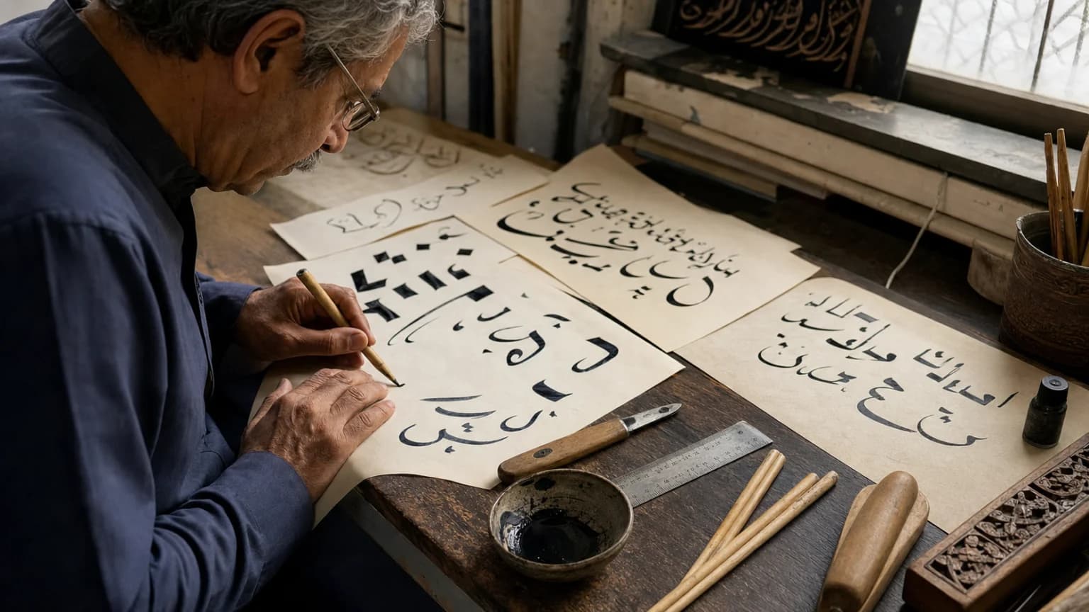
最後,把書法原件與裝裱、藏主題記和後加部分分開。簽名可能在一角,另一時期的註記在別處;中央樣本與周圍藝術布置可能有不同歷史。請透過本文連結的館藏圖像和編號查看具名作品。本文封面僅作一般說明,不是這些手稿的摹本或書體鑑定表;封面上的筆畫不能用來轉錄經文或認證歷史字跡。
資料來源
- 大都會藝術博物館:《阿拉伯文字與書法藝術》第二單元——比例點、六種比例書體與庫法體變化的教學依據。
- 大都會藝術博物館:《藍色古蘭經》書葉2004.88——核對年代範圍、羊皮紙、金銀及有限定的產地歸屬。
- 大都會藝術博物館:哈姆杜拉冊頁1982.120.3——小字納斯赫體與較大蘇魯斯體或穆哈卡克體的同頁比較。
- 大都會藝術博物館:大理石紋紙藝術——Yana van Dyke於2015年對文字排列、裝飾紙條與拼合邊框的分析。
- 美國國會圖書館:文字描述板2019714648——核對制作者、1130年/1718年紀年、書體與折疊木板形式。
- 史密森尼:納斯塔里克體與波斯書法——文學脈絡,以及S1986.30書寫與繪畫的不同日期。
- 史密森尼:蘇丹·阿里·馬什哈迪——有紀年《薔薇園》F1998.5及字組節奏的說明。
- 史密森尼:大師與學生——書體特徵、有限定的發明歸屬、蘆葦筆與材料準備。
- V&A:伊斯蘭藝術中的書法——宗教與世俗文字、材料及裝飾功能。
- 大都會藝術博物館:伊斯蘭藝術中的書法——文字傳達內容與視覺裝飾同時存在的解釋。


